WORK | CASE STUDY
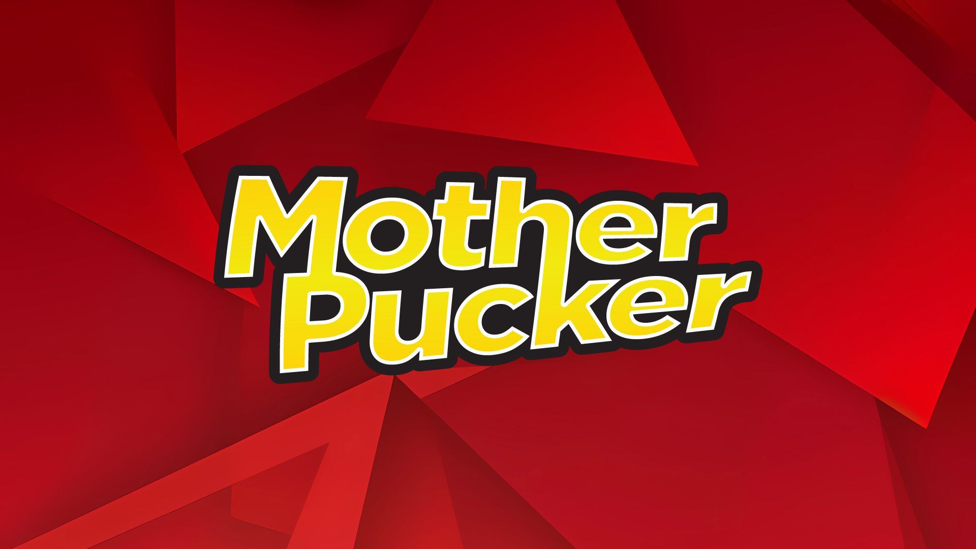
MOTHER
puckers
BRAND IDENTITY |
PRINT |
PACKAGING |
DIGITAL |
WEBSITE
Client
Mother Puckers
Industry
Food – Candy
Scope
Brand Identity – logo, type, colors
Print Ads – Postcards, flyers
Packaging Design
Digital – Renders, ads, social media
Website Design – Ecommerce
Deliverables
AI • EPS • PDF • PNG • JPG

THE BRIEF
"We needed a brand bold enough to match Our puckeringly sour, naturally clean candy."
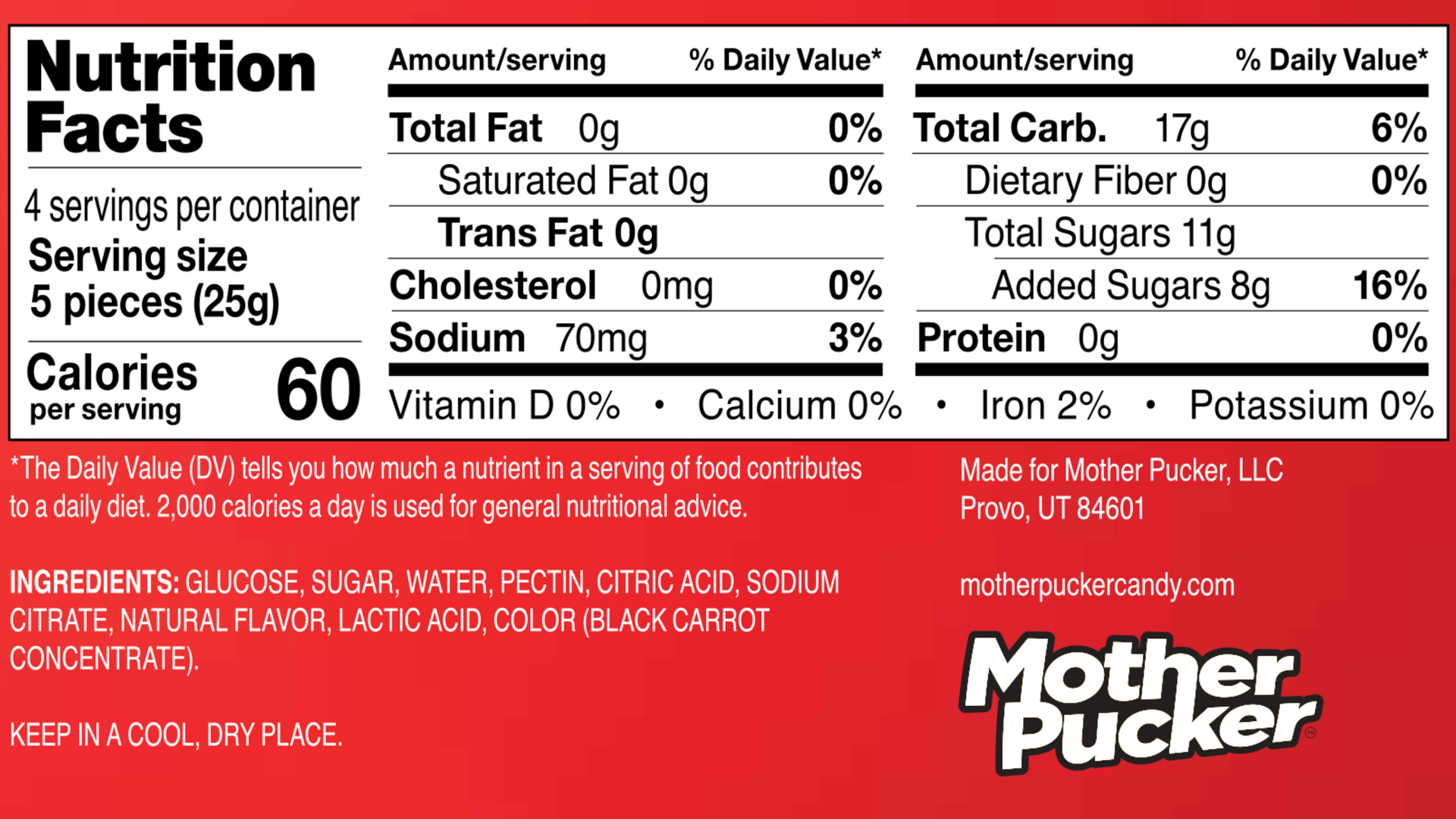
Mother Pucker came to Limitless with a clear product vision: a sour gummy that tastes like the real thing but is made with natural ingredients — vegan, non-GMO, superfood-colored, and free of the artificial chemicals that dominate the candy aisle. What they didn't have yet was a brand identity or any visual presence.
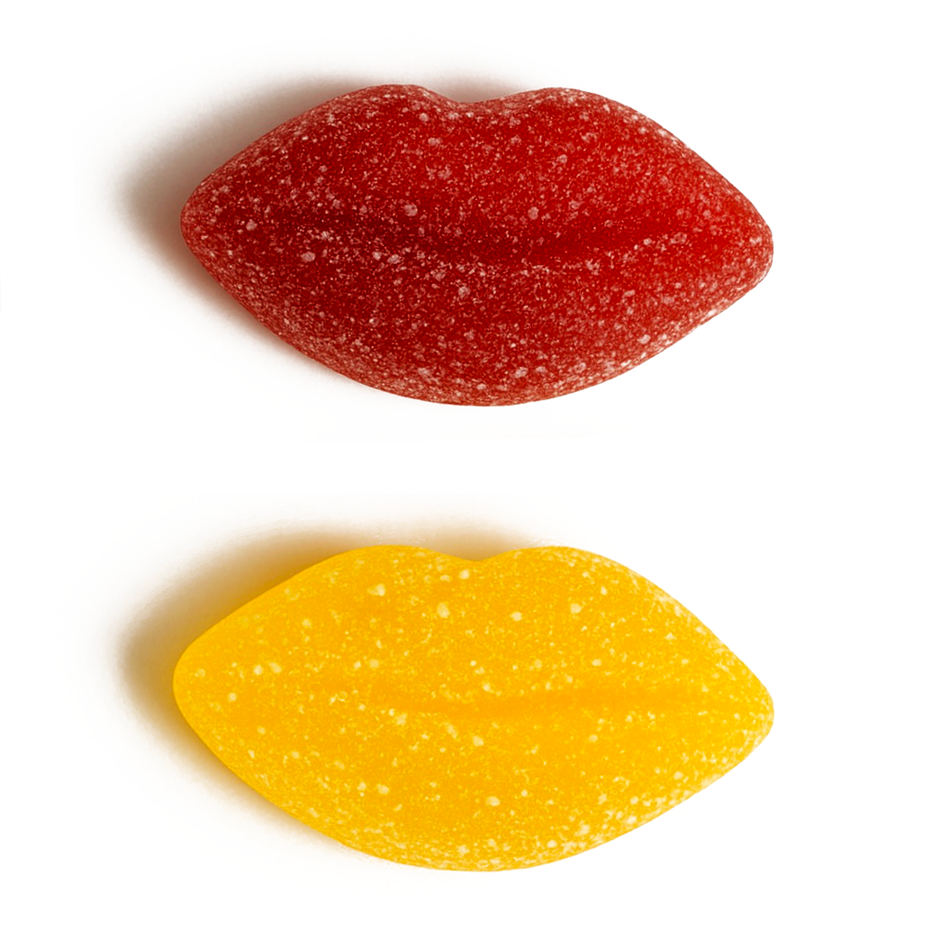
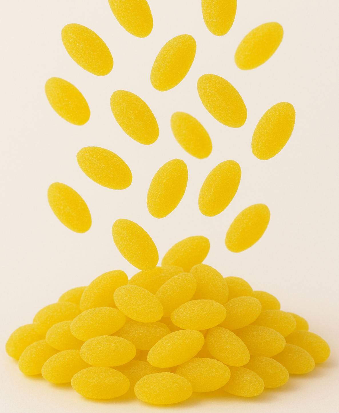
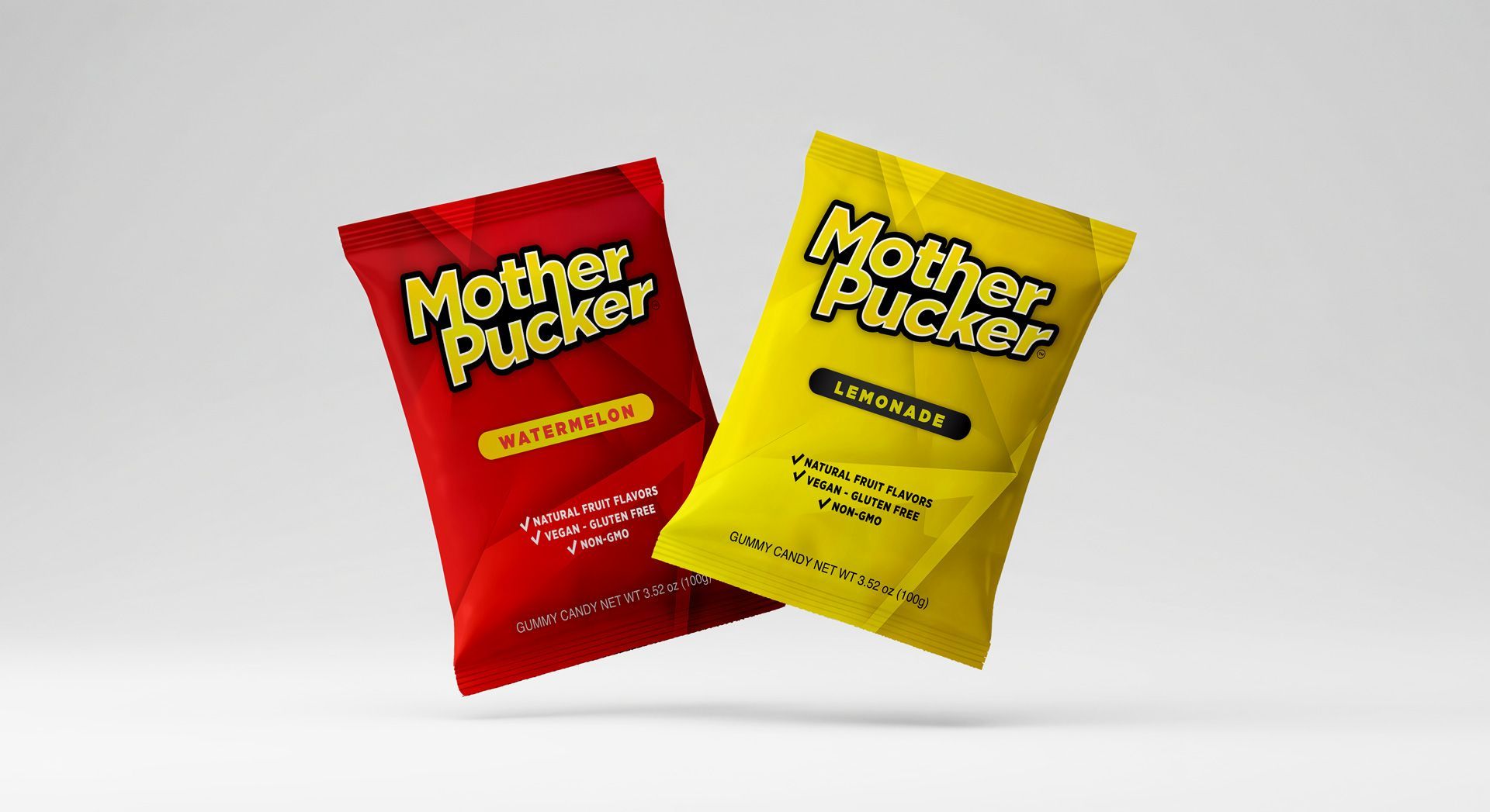
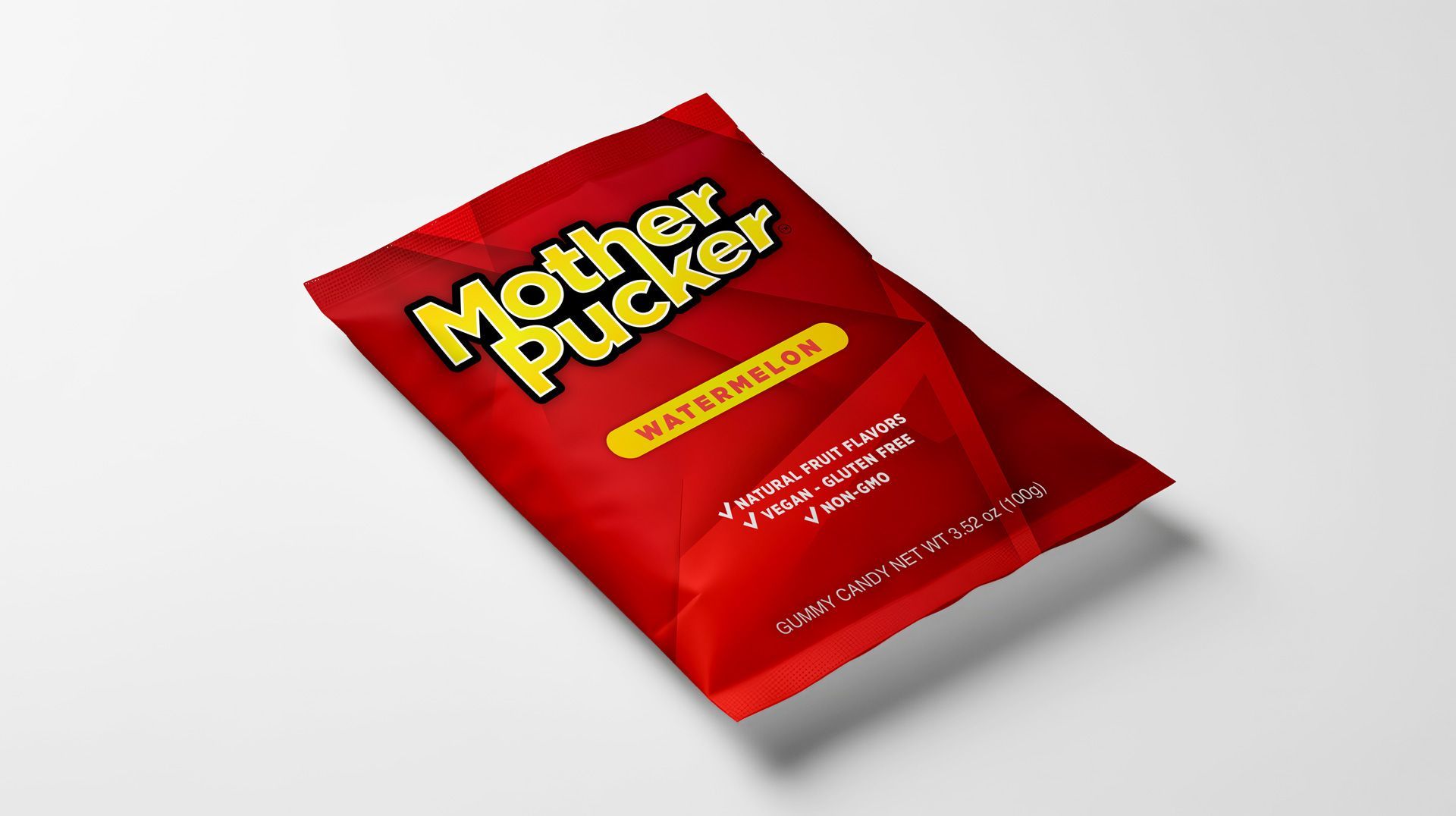
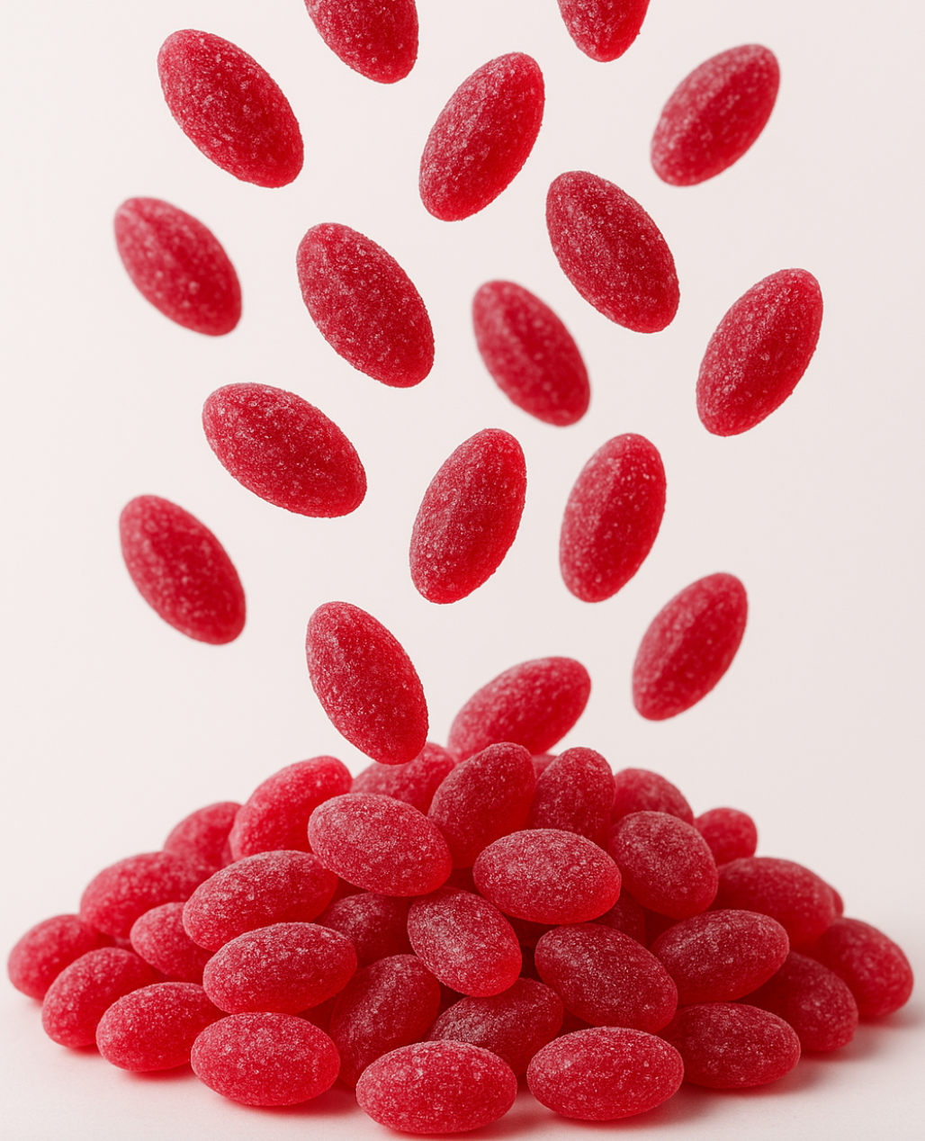
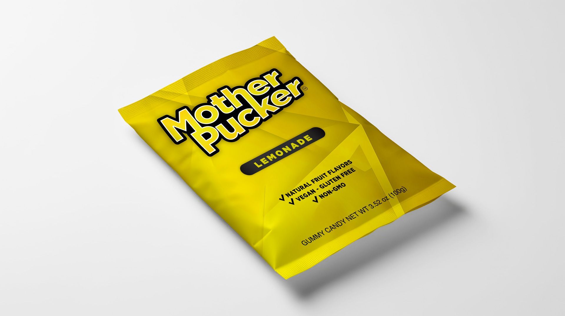
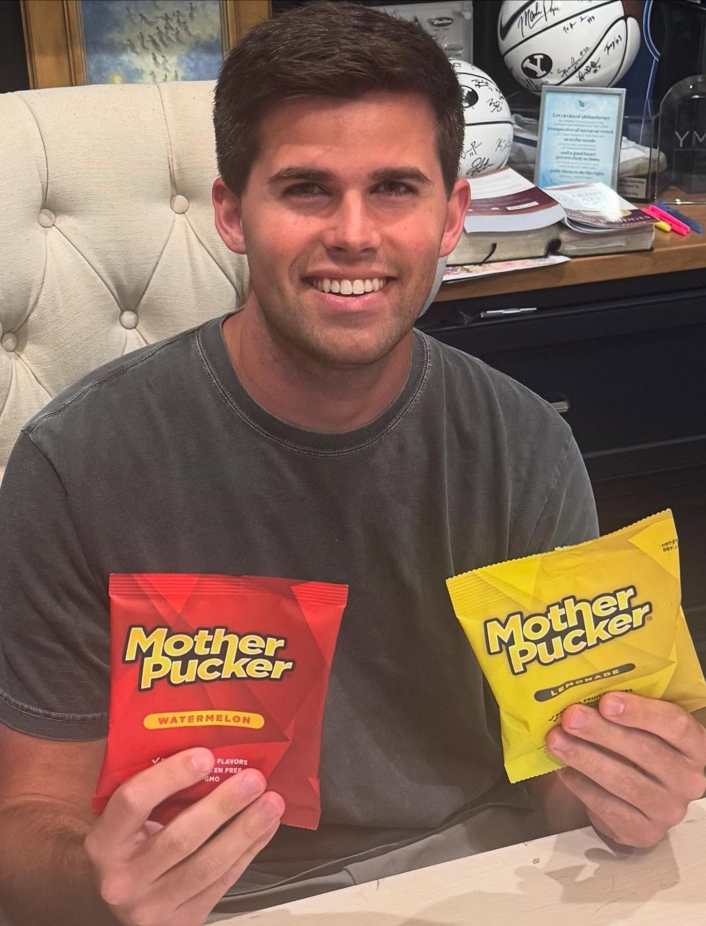
The ask was full-stack CPG creative: a name-forward logo with serious shelf attitude, retail-ready packaging for two debut flavors (Lemonade and Watermelon), photorealistic digital renders for investor decks, press, and social media, and a Shopify e-commerce site built to convert from day one.
The brand needed to walk a precise tonal line — irreverent and edgy enough to own the name, while clean and premium enough to signal the better-for-you positioning that sets Mother Pucker apart from mass-market candy competitors.
CHALLENGES TO SOLVE
BRAND TONE PRECISION
The name is bold — the brand had to own it without crossing into cheap or crass. Premium-edgy is a narrow lane that requires exactly the right typography, color, and attitude.
RETAIL PACKAGING THAT POPS OFF THE SHELF
The candy aisle is one of the most visually aggressive retail environments. The packaging had to stop a shopper mid-stride — while still communicating clean, natural ingredients.
PHOTOREALISTIC RENDERS BEFORE PRODUCTION
Digital renders needed to show investors and press exactly how the finished product would look — lifelike enough to appear in marketing materials before physical samples existed.
SHOPIFY E-COMMERCE SITE
The Shopify site needed to sell — hero imagery, product pages, flavor-level storytelling, and multi-pack bundle logic all built for conversion from launch day.
"Limitless took our product concept and turned it into a brand that looks like it belongs on the shelf next to the biggest names in candy — before we'd even gone to print."
— CREW LAWRENCE
Co-Owner, Mother Puckers
NEED SOMETHING
similar?
Let's get started on your project today.