WORK | CASE STUDY
KARY
Oberbrunner
PRINT |
BOOK |
REDESIGN |
DIGITAL
Client
Kary Oberbrunner
Industry
Books — Self Help
Scope
Book Re-design
Brand Identity – Imagery, type, colors
Packaging Design
Digital – Covers and renders
Deliverables
AI • EPS • PDF • PNG • JPG


THE BRIEF
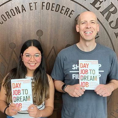
"Three books from different eras of my career — I needed them to look like they all came from the same author with the same vision."
Kary Oberbrunner is a Wall Street Journal and USA Today bestselling author, TEDx speaker, and CEO of Igniting Souls Publishing Agency — a global platform that has helped over 250,000 authors turn their books into 18 streams of income. With 14 books across personal growth, leadership, business, and self-discovery, his backlist is one of his most valuable assets.
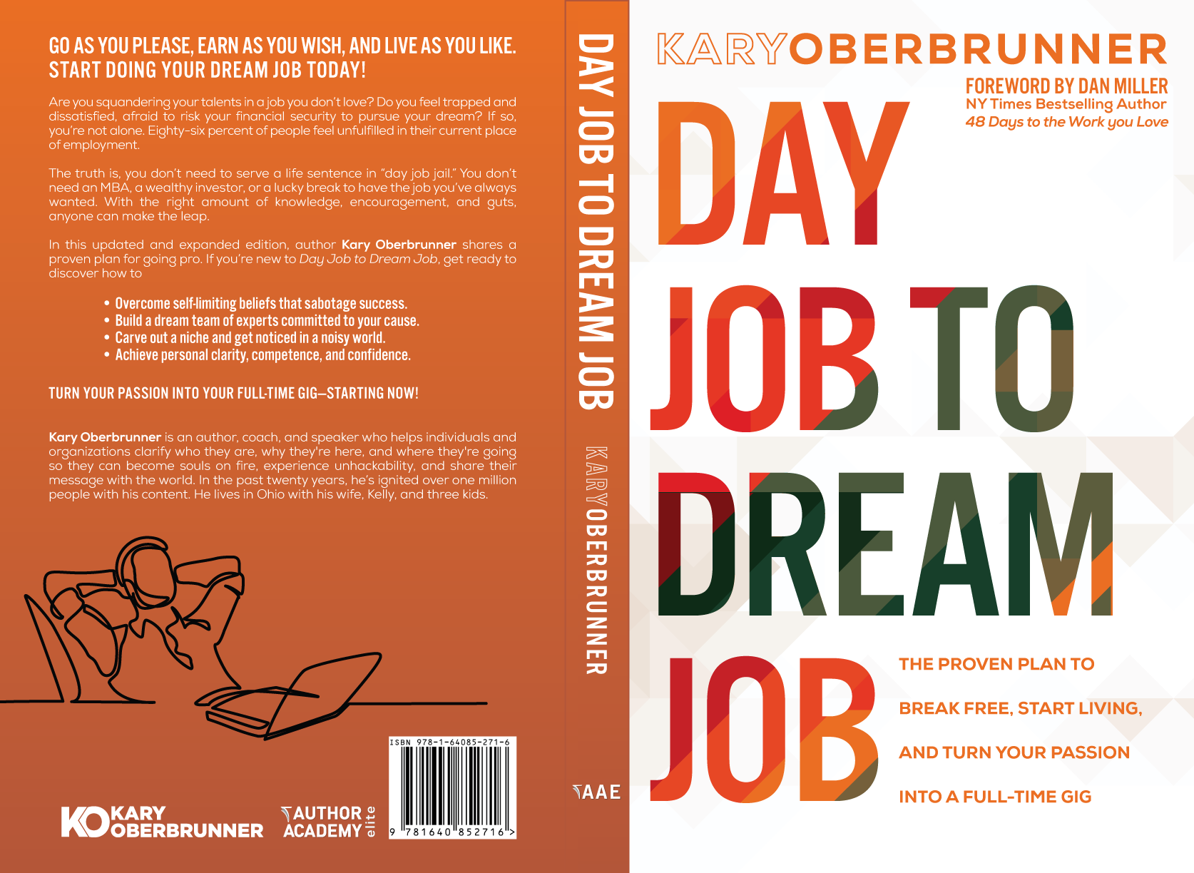
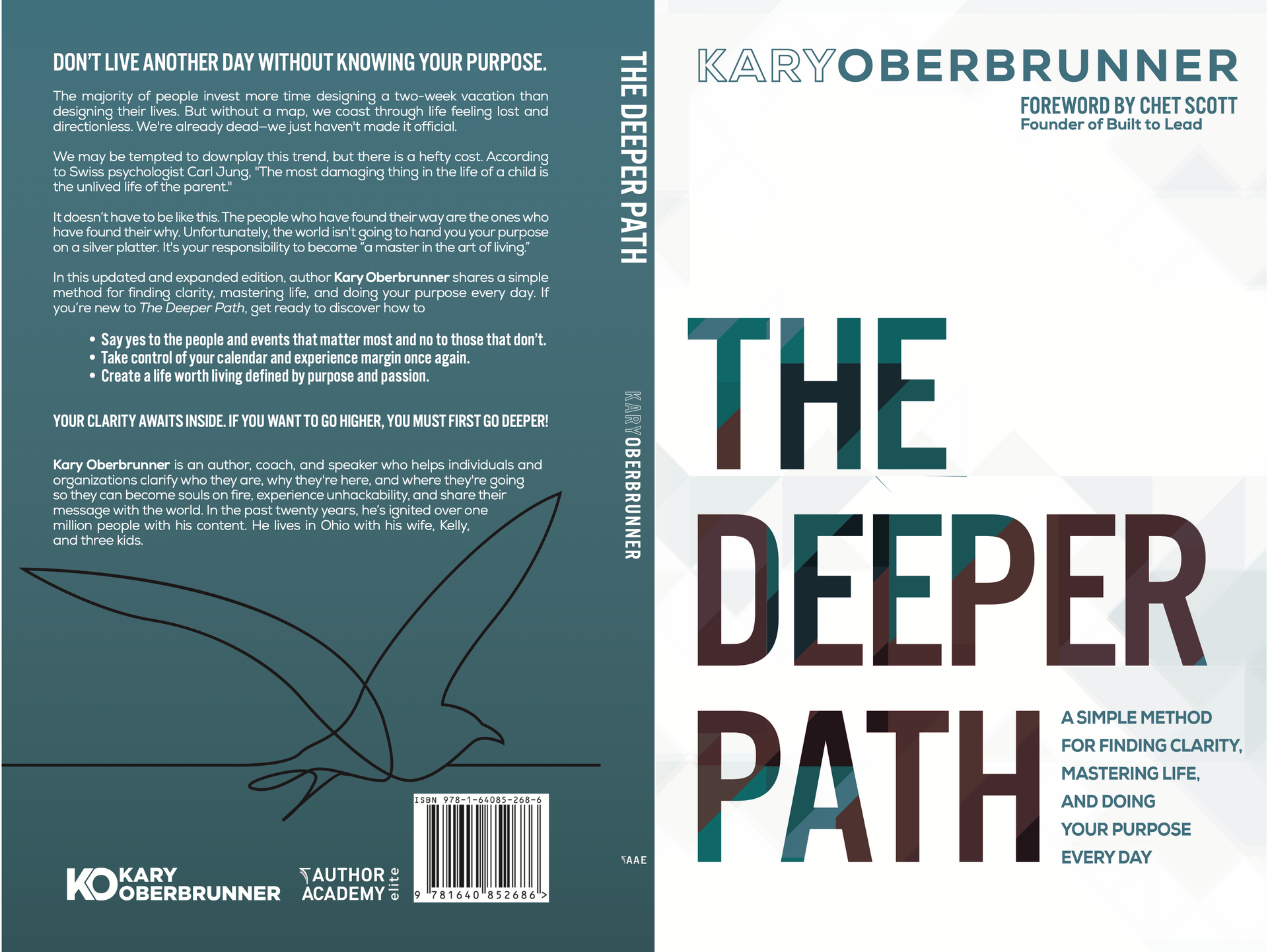
The rebrand brief was focused on three titles that had become foundational to his audience: Day Job to Dream Job, The Deeper Path, and Your Secret Name. Each had been published at different points in his career and carried different visual identities — inconsistent typography, color stories, and layouts that didn't signal a unified author brand when displayed together on a shelf, a website, or an Amazon page.
Limitless designed a cohesive visual system that rebinds all three titles under a single recognizable aesthetic — built for both print production and digital release — while giving each book its own distinct color identity within the shared framework.
CHALLENGES TO SOLVE
COHESION ACROSS THREE UNIQUE TITLES
Three books with different subjects, tones, and audiences needed a shared design language — without any one cover looking like a copy of another.
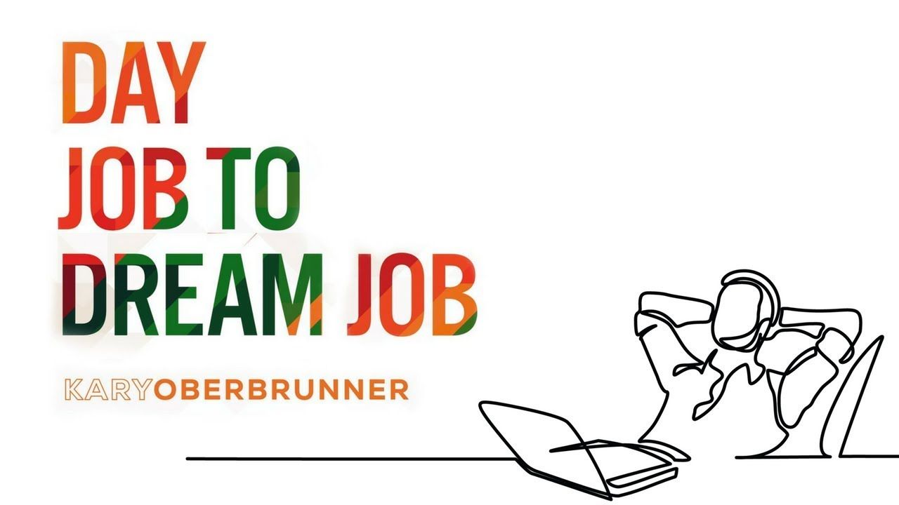
Geometric system that scales
The layered geometric type treatment had to work across radically different title lengths — from the two-word "Day Job to Dream Job" to "Your Secret Name" — without breaking the layout logic.
AUTHOR BRAND ELEVATION
The covers needed to signal "WSJ bestselling author" at a glance — premium, bold, and shelf-competitive against traditionally published titles.
PRINT & DIGITAL DUAL FORMAT SPECS
Every cover had to meet print production specs (bleed, CMYK, spine width) and read equally well as a digital thumbnail on Amazon, Kindle, and promotional graphics.
"Geno took three books from different chapters of my career and made them look like they were always meant to be a series. The rebrand elevated the entire backlist."
— KARY OBERBRUNNER
Author

NEED SOMETHING
similar?
Let's get started on your project today.